


Magazine advert analysis


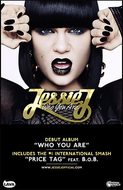
The use of the gold graphics on her hair and in the background link to the title of her album, creating a synergy between the image and the album.
Through the use of the colour gold, the advert connotes....
By including the artist centrally it conforms to the conventions of an album advertisement, also by making Ellie Goulding gaze to the left it represents....
A stylised font is used which connotes... classic 'Gatsby' 1920's feel... bold against the dark background...links to the title of the album...
The reviews are... once again following the convention of a magazine advert.
Overall contrast of the gold and light against the black and darkness creates an effect of...
facial expression Mulvey + male gaze
costume
font
colour
website
Colour
facial expression and open mouth
Similar contrast to black and gold however through other aspects creates a different effect
Website
costume